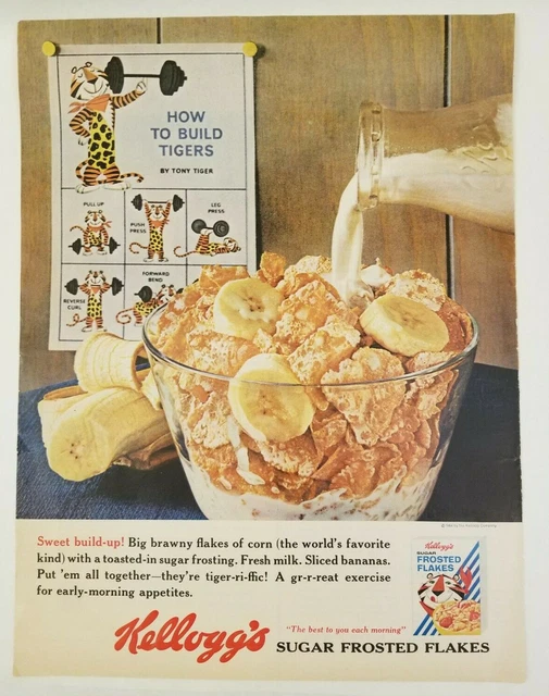
|
Visual- saturation |
The color is not
vivid and has that old TV look |
|
Visual- low
contrast |
Not many
shadows or differences in the colors look |
|
Visual-
geometric |
It shows the
depth of the poster behind the cereal and the banana also going behind the
cereal |
|
Visual- closed |
The milk is
going off the page and the bowl is also off the bottom. |
|
Visual- full |
The ad has a
lot of space covered and is very active. |
|
Visual-
grounding |
The cereal is
in front, the banana is in the middle, and the poster is in the background |
|
Visual- high
angle |
The ad has a slightly
high angle |
|
Schemes-
tmesis |
Tiger-ri-iffic,
gr-r-reat |
|
Tropes-
hyperbole |
(the world's
favorite kind) |
|
Visual-
abstraction |
A tiger is
working out on a poster |
|
Type- all
caps |
The names and
the poster have all caps |
The target audience for this ad is the health-conscious consumer. If the art poster in the background was not there, there would be no way of knowing that this product is healthy. In the text, it mentions the toasted sugar coating on corn--two things that health-conscious consumers do not find healthy. However, the poster gives some visual affirmation that by adding healthy fruits, the meal can then be considered as healthy. While the atmosphere of the image is calm, it's very deceptive.
ReplyDeleteThe ad is very bold, the graphics in this are almost eye level, like the images of the cereal-related content, and although the saturation is not vivid and noticeable, the image itself is, it is hard to ignore. Viewers are also shown a banana alongside a fitness poster in the back, when I see this, I think of protein and how that is eventually supposed to help if you are well in the fitness, gym life, especially how much you consume. I think this leads to the picture and how the bowl is obviously big and packed with cereal. I think there could be a correlation with that. Nice analysis.
ReplyDeleteThe ad itself is very bold in more ways than one, for instance, the large scale of the bowl of cereal as well as the Kellogg's brand attempting to appeal to health-nut consumers. Many of us know cereal to be the not-so-great breakfast choice, however this ad is very deceptive to the uneducated eye. The ad uses a tricky play on words such as "Sweet build-up!" along with the placement of the banana directly next to the workout poster trying to hint at the fact that it's "healthy" and would be a great option to help you build muscle. It is the perfect set up for s strong argument that not everything is as it seems.
ReplyDelete