Links to rhetorical tools:

Here are links to the rhetorical tools used in this class:

Schemes & Tropes -- Perelman & Olbrechts-Tyteca -- Fallacies -- Burke -- Rhetorical Toolbox -- Conspiracy Rhetorics

Monday, January 29, 2018

Mattel's Tuff Stuff


Fisher-Price Toys Catches Heteronormativity at the Price of Propagation

     The picture below is slightly blurred because I had to use a screenshot in the creation process, but it is mostly readable. Sorry for that. I briefly cover what I noticed first hand and what I noticed after a few minutes of deeper analysis. 

     There is a lot at work here, but none of it is what I would call shocking or surprisingly, sadly. Who said ads about baby toys were not political? Guess what, everything is political. Poor infants. 


     This could easily be a white feminism argument, because it is a white washed ad, but I am going to try to take a more womanist approach when it comes down to creating a thesis and more solid analysis about this ad, for I have a few that are at work in my head. 


Here we have the data chart. Have fun with the things. This was hard because there is such a heavy prevalence of both text and image. Each toy could be analyzed, each sentence, the baby, the title, each element could be broken down and there is so much of each. I kept it brief for that reason. It can get overwhelming.


Master of the Universe Ad Data


Data Rhetoric Analysis


Arrangement
Climax
Words build up until the end where the idea of childhood is emphasized
Repetition
epistrophe
Repeats the word childhood at the end of sentences
light
High contrast
Background id plain in order to convey the sense of an open canvas
color
saturation
Uses brighter color for toys to make them stand out
perspective
geometric
Some illusion of depth to make world of characters seem bigger
space
full
Picture is filled with stuff, especially toy figures
figures
abstraction
Angle used to show all figures as if they are interacting in order to convey a sense of world building for the child to encourage more toy purchase

Poochie Analysis


Hot Wheels Rod Runner

Analysis of Rhetorical Devices
Repetition
Epanalepsis
Repetition of a word at the beginning and end of a clause.
They use the phrase “side by side” a few lines down into the body of text.
Comparison
Simile
An explicit comparison.
The text at the bottom assures viewers that the experience/stakes given by this track are “just like real racing” after building up the higher stakes and real competition coming from this track.
Color
Saturation
The purity or vividness or depth of a color.
The saturation is relatively high; all the colors are slightly muted but are bright enough to stand on their own and be noticed.
Light
High Contrast
Bright lights and dark shadows.
The central image uses thick, dark lines to outline both the tracks and people. Also, the colors contrast quite well against the cream background while having dark shadows on the cars.
Diagonals
Oblique
The image seems unstable and pulled to the side.
The entire image is pulled to the right because the track can run off of the page. This adds to the size/grandness the ad attempts to portray.
Space
Open
The tops and sides seem empty.
The background is a very mute cream with no details in it whatsoever. Aside from text, the ad is void of background imagery.
Angle
Eye Level
Are we even with them?
We are placed at eye level with the track. In doing this, the size of the track appears much larger than it truly would be. It also makes the product being sold seem exciting.
Style
Bold

The entirety of top text is bold and sharply contrasts the background. Almost all information at the bottom is normal but they do bold some words; giving them importance and giving variety/intrigue to what it is saying.
Family
San Serif
Without serifs.
The font is very simple and easy to read. There aren’t any “extra” or connecting lines; it’s incredibly basic.


Unico Blogpost

Isaac Marcell

My First Barbie


Sunday, January 28, 2018

THE SIX MILLION DOLLAR MAN!


Fisher-Price Sportcar


Evel Knievel 1976 Ideal Toy Corp. analysis


Schemes
-assonance

The constant of vowels that are laid out amongst the ad within the catch line and the captivation ties in the “catchiness”
Tropes
Exaggeration through the phrases of the subtext. It helps reveal the thrill to the intended audience which ties into the nature of toy’s background.

"Evel" origanted from Evil. Sense of thrill  -Attachment to advertised figure.
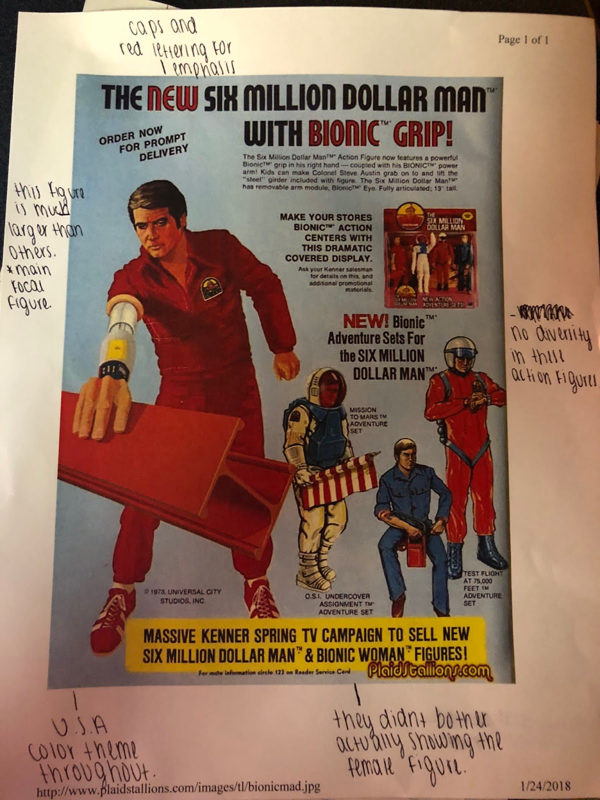
Visual
-eye level: given the perspective to see the figure as if they were right in the site. Provides to the demonstration of the toy.
-High contrast: Dark shadows help give the depth to the figures, which leads to the captivation of the essence. The red white and blue are the repetition of colors reiterating the intended appeal to the intended audience in the given period.
Style
-All Caps and Bold title. Gives automatic appeal with the use of repeated colors.
-spacing: more of whiter spaces within subtext for extra info. Not important for bringing in audience as much as informing by this point.

LEGO Ad: What it is is beautiful.


Play_Doh Analysis


Bold Text
The words Look at all the friends you can make with Play-Doh! are in bold as it is the major selling point of the add. The add has all big names that children love: Darth Vader, Big Bird, Fred Flintstone and Strawberry Shortcake. The goal of this ad is to make children feel like if they get Play-Doh all these characters will be their friends (I question why Darth Vader is included as a ‘friend’ but what the hell do I know?
Open Space
Around the characters there is a lot of open space to the left and right of the ad. It could just be coincidental but my best interpretation of it is the idea that if you buy Play-Doh, you will have your place alongside the likes of these characters to the right by Fred of to the left by Strawberry Shortcake. After all, who in at least one point in their life hasn't wanted to have a casual chat with one of these characters
Geometric
The only depth perception within the ad is the relationship between the characters and the Play-Doh. The characters are tucked neatly behind the Play-Doh to emphasize that although they are apart of what you get with it, the Play-Doh is still the primary focus of the ad. Even characters that are far taller than the Play-Doh like Big Bird are still hidden behind it
Medium Shot
The Medium Shot is important for this ad as we are dealing with big, identifiable names. We don't want to be looking up at characters like Big Bird or Darth Vader from the ground up, but at a view where all the characters are identifiable, especially with characters with faces as identifiable as these! 
Low Contrast
Every character in the photo is brightly drawn, including Darth Vader who could've easily been far less bright than he is in the photo. Play-Doh is a children's toy which makes the brightly colored ad very understandable 
Eye Level
All characters are at eye level, looking directly at the kid they are aimed for. It's standard advertising practice that kids mascots be facing the kids, which is why cereal mascots are almost always looking down on the box. This ad isn't an exception 
Foreground, Background
 As explained before, the characters are in the background selling the product which is the focus in the foreground