


Analyzation of
Rhetorical Devices
|
|||
Color
|
Value
|
The lightness or darkness of a color.
|
The entire ad is very light and almost blends in with the skin tone
and clothes of the people.
|
Light
|
Low Contrast
|
Little difference between darks and lights.
|
Most of the colors meshed together. There were different colors but
they were all fairly light.
|
Perspective
|
Geometric
|
An illusion of depth and space.
|
This was mostly visible when looking at the man and the woman. They
both appeared to be 3-D with the way that shadows were put near their hands
or heads.
|
Space
|
Closed
|
The tops and sides feel enclosed, trapped.
|
The bodies of the man and woman fade into the background of the ad so
it gives off an effect as though everything in the ad comes together and isn’t
separate.
|
Angle
|
High Angle
|
Are we looking down at them?
|
Yes, there is a slight angle to where we have to look down on them
because of the 3-D effect and the fact that the computer that they are
looking at is below them.
|
Implied Distance
|
Close-ups
|
Is the subject one person’s face?
|
It isn’t just one person’s face that is close-up in the ad, but it’s
both the man and the woman’s faces that are so close you could see up their
nostrils is they were real.
|
Figures
|
Abstraction
|
How realistic are things?
|
Surprisingly, the pictures and designs in this ad are very realistic.
The people look incredibly real, but if you look close enough, you can tell
that it is a drawing/painting. The computer is also very real-looking.
|
Stroke-height Ratio
|
How thick are lines in the type in comparison to the height of the
letters?
|
The lines in comparison to the letters are very evenly distributed.
|
|
Style
|
Bold
|
Both sets of text are bolded so that it would be easier to read and
catch the eye more.
|
|
Italic
|
The word ‘before’ is italicized to prove a point that people say this
quote before they realize how smart
they are.
|
||
Emphasis
|
Color
|
The emphasis is on the color because different colors are used to
represent different areas of the ad.
|
|
Family
|
Serif
|
Lines to link the reading of letters.
|
The serif font is much easier to read and makes the ad appear more
official and has the ability to make people feel smarter.
|
Spacing
|
Tracking
|
Spaces between letters along a line of text (manipulated relatively
evenly)
|
The spacing between each set of texts is very even and also creates
for an easier read.
|
Leading
|
Spacing between the lines of text.
|
Just like the spacing between the letters, the spacing between the
lines is very similar and spaced out evenly.
|
|

Schemes/ Tropes:
|
|||
Schemes:
|
1.
Orthography
|
acronym
|
IQ 140, IQ 120
|
Portmanteau
|
Interface
|
||
2.
Alliteration
|
Consonance
|
A beautiful way to interface
|
|
Tropes:
|
3.
Exaggeration
|
Hyperbole
|
“a beautiful way to..”
|
Visual:
|
4.
Colors
|
Hues
|
Black to blue
|
Value
|
Light blue to dark blue/ black
|
||
Saturation
|
High to medium towards the top
|
||
5.
Light
|
High contrast
|
Light at the top, creates saturated
shadows
|
|
6.
Perspective
|
Geometric
|
Woman behind the computers
|
|
7.
Diagonals
|
Balanced
|
Both sides are even in weight
|
|
8.
Space
|
Full
|
No room for white/ blank spaces
|
|
9.
Focus
|
Grounding
|
Text = foreground
Computers= middle
Woman= back
|
|
10.
Angle
|
Eye level
|
We are looking pretty much directly at
the picture
|
|
11.
Implied
distance
|
Medium shot
|
The woman’s main focus is from the
waist up
|
|
12.
Figures
|
Abstraction
|
Everything is pretty real looking in
the add
|
|
13.
Genre
|
Style
|
Scifi-futuristic vibe
|
|
Type:
|
14.
Stroke-height
ratio
|
Line thickness compared to letters
|
Heading has a big difference in lines
compared to letters. Smaller text and
company name has equal lines to letters.
|
15.
Style
|
Bold
|
Title/ IQ 142/120
|
|
Condensed
|
Little text under the computer is
|
||
All caps
|
Logo and address texts is
|
||
16.
Emphasis
|
Color
|
Heading dark black, description is
small white lettering, company and address is larger white lettering
|
|
17.
Family
|
Serifs
|
Heading has serfis
|
|
Novelty
|
“Vintage computing and gaming” is in a
hi-tech looking font
|
||
18.
Spacing
|
Tracking, kerning, leading
|
All pretty average
|
|
19.
Legibility
|
Font
|
All larger font is easy to read
|
|
Copy issues
|
The white description is illegible
|
||
Schemes
|
|||
Orthography
|
Acronym
|
Abbreviations using
initial letters
|
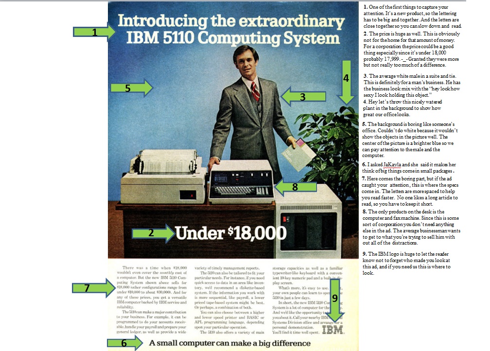
Yes, IBM is a
company which stands for International Business Machines. The name is too
long to keep writing over and over again, and to the average business man,
you need something short, quick, and simple, which will give the reader
patience to read the rest of the ad. Granted IBM are acronyms that have
always been used when dealing with computers.
|
Visual
|
|||
Color
|
Saturation
|
The purity or vividness
or depth of a color
|
The blue in the
background in the center has I would say moderate saturation. Since this is
trying to portray a basic office setting, the blue couldn’t be too dark or
too white. Although this ad is going for the basic look, there still needed
to be enough color to make the objects stand out.
|
Angle
|
Eye-level
|
Are we even with
them
|
When you first
glance at the ad after reading the big bold print, you’re most likely will
find yourself staring at the guy’s face. In order to capture the business
appeal, they put a guy who isn’t all the way smiling but not all the way
angry to target that particular audience.
|
Implied Distance
|
Medium Shots
|
Is the subject
people in interaction (waist up)
|
The whole point of
the ad was to show the computer. Since the computer is being advertised to
businesses all you needed to see was the top part of the suit to signal
business.
|
Type
|
|||
Style
|
Bold
|
X
|
All the words that
are needed to capture your attention are in bold. This allows the reader to
notice what’s being advertised before getting down the maintenance.
|


