Links to rhetorical tools:

Here are links to the rhetorical tools used in this class:

Schemes & Tropes -- Perelman & Olbrechts-Tyteca -- Fallacies -- Burke -- Rhetorical Toolbox -- Conspiracy Rhetorics

Thursday, January 29, 2015

Cavalier's Stuff

Alliteration
consonance
In the ad there is a part that says and wear and wear and wear. Which is repetition of not only sound but words itself.
Alliteration
Assonance
same but with vowel sounds
Emphatics 
Diacope
In the first paragraph we get that it will be a MERRY Christmas if you give mojud to your lady. Getting lucky or having sex as a reference.
Emphatics
Enumeratio
In the part where we see the - - -  that is the argument is “valid”
Puns
Paraprosdokian
The part where Christmas belle is said is what I am referring to for this.
Exaggeration
Hyperbole
The dazzle a damsel, flatter the figure, and wear and wear and wear!
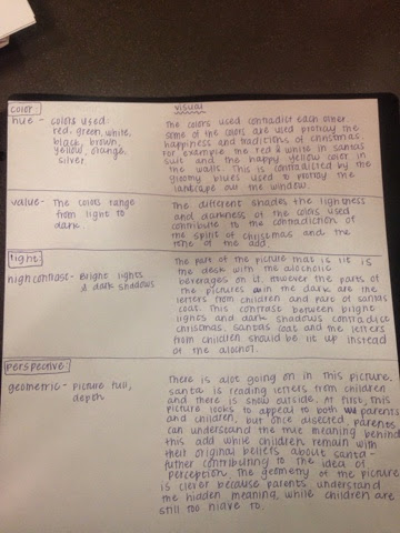
Color
Value – very dark
Saturation- dark and saturated
Light
Low contrast
Very dark giving the sense of something bad may happen, or something “bad” (naughty, sexual)
Perspective 
Geometric
Santa is farther back giving us the sense that the girl is on his lap
Space
Empty
The picture seems empty leaving much to the imigination
Angle
Eye-level
So we can see everything in its order
Implied distance
Medium long shot
Full body in the picture but not enough missing for the imagination to go crazy
Figures
Abstract
Things aren’t all to real and the santa behind the woman looks even more fake than she is
Stroke weight
Stroke weight continued
The stroke changes from some parts to another where is almost seems as if they don’t truly go together

Style
Slightly bold at points, mostly on MOJUD

Family
Script
The first part looks as if it is almost written by hand


Picture here, it wouldn't come through well

http://vintage-ads.livejournal.com/3037538.html


IT SAYS
To make it merry…make it MOJUD

Listen…you beloved, be-whiskered Santas! To make it a MERRY Christmas give Mojud…stockings and lingerie.
            For Mojud stockings are sheer and dear to the feminine heart. Extra “give” and spring back in the knit, make them fit-feel-look-wear better, too! Fashion Harmony shades.
            And Mojud patented slips, panties, nighties, and pajamas are dream-stuff for your Christmas Belle, too! The dazzle a damsel, flatter the figure, and wear and wear and wear!
Stockings and Lingerie by Mojud


My argument is that you can only make your woman feel like a woman with mojud and thats the only way you'll get any (sex)!

Mojud is clear so it is easily readable and able to be made out. 
Make your woman feel like a woman.
Telling men that don’t know what to get their woman that this is what she wants.
Even santa cant resist a temptress.
Even naughty people get to sit on santas lap ;)
Your woman doesn’t look good unless its MOJUD.
Christmas isn’t Christmas without MOJUD.
Mojud has everything a lady could want, you just have to pick for her.

Woman are dreaming of Mojud.

Wednesday, January 28, 2015

Samantha Lopez Santa Elaboration


Example
Elaboration
Schemes


Error
Tmesis
“Throat-Scratch”
This add claims that Pall Malls “guard against throat-scratch” because the length of the cigarette acts as a filter for the smoke

Alliteration
Consonance
“fine tobaccos is filtered further”
This statement claims that the tobacco was filtered to make it milder or healthier


“Smooth smoking”
The statement shows how the smooth smoking is easy to smoke


Assoance
“Puff By Puff”
Shows the emphasis on how the puffs compares to other longer cigarettes.


“Extra length for extra mildness”
This statement was for the “mild” was to state that mild was health to make a health and skinner you


“Pall Mall’
Stating the product that is health

Hyperbaton
Anastrophe
“Again after 5 puffs”
This means that after the 5 puffs you will feel healthier and the again shows are people are tempted to smoke more cigarettes

Emphatics
Scesis Onomation
“The further your cigarette filters the smoke through fine tobaccos, the milder the smoke becomes.”
This means that the mild in the cigarette can lead to regular length cigarettes and that it will filter out more smoke when you are smoking Pall Mall cigarette

Arrangement
Climax
“Thus Pall Mall gives you a smoothness, mildness and satisfaction no other cigarette offers you”
This statement is shown with “The Puff Chart” which is comparing other cigarette to Pall Mall and show how the regular-length cigarette with smoothness and satisficing. 
Tropes
Comparison
Metaphor
“You’re always ahead with Pall Mall”
This statement how smoking Pall Mall mild can smoke a greater length with smoke so the smoke can get ahead


Synecdoche
“Outstanding…and they are mild!”
This shows hold mild the cigarette can get and underlined so that can be healthier for the customer.


Tuesday, January 27, 2015

"Sexy Santa Eyes" Bailey Merriman

Table for Sucky Santa by Megan Larsen


Mason Allenger - Santa Ad #32 Analysis

Ad w/ notes:
Santa 32
Reflection:
I'm convinced that drawing a bald eagle perched upon the crying boy's back or changing the blank background to an American flag are the only manners by which this ad could be made more patriotic. This is an ad by The Cleveland Welding Co., the metal company that makes bikes for Roadmaster. The ad is basically a consolation to whoever is unlucky enough to receive it saying that "I'm sorry you didn't get a bike this year; the company who makes them is too busy supporting the troops to care about you, but you are getting the next best thing! That thing? A war bond. The kid is obviously white, his hair is obviously blonde, and his eyes are most likely blue - the cliche American boy. As such it's no wonder that he only shed two tears. After all, the welding co. is making war materials for his big brother, and the other millions of American troops. Making sacrifices is the American thing to do! Moving on, the most interesting parts of this ad are the author of the words written and the relationship between father figures, Santa, and the welding company. The first three words imply that it's written by a father, or even a grandfather - really any male elder, honestly. But later in the text "This Christmas your dad's bought you.." suggests that it isn't the father speaking. Is it Santa or the company? It's obviously up to interpretation, and it is my belief that the creator of the ad uses such a diverse voice to make sure the ad is compelling to as many people as possible.

Table:
tropes
5) exaggeration
hyperbole
The writer says that war bonds are the “best kind of present.” This is obviously untrue as best extremely subjective. Hyperbole is used to try to persuade the reader to buy war bonds with the money they didn’t use to buy a bike.

7) apophasis
euphemism
The Cleveland Welding Co., the company that supplies Roadmaster bikes with their material, obviously makes products with metals. As such, we can safely assume that “war materials” refers to weapons of some sort (guns, tanks, etc.), therefore making the term a euphemism.
visual
5) space
open
There isn’t much to the picture. There is really only Santa, the boy, and text. There’s no extravagant color or even pictures of their product. To me this is the company saying, “we’re really too busy saving the troops to even make this add, but we will because we care about you”

7) angle
low angle
It’s not incredibly pronounced, but the viewer is slightly looking up towards Santa and the boy. This works to cause the reader to hold the two in a higher light. The boy is making a sacrifice so the reader should too.

8) implied distance
close-ups
The drawing of Santa and the boy are close-up. Close enough for the viewer to see the tears falling from the disheartened boy’s face and Santa’s big, comforting hand wrapped around his back in a fatherly way. These things couldn’t be accomplished as well at any other distance.

9) figures
abstraction
The boy in the picture is obviously concrete, and although oddly, so is Santa. The subtracted cheeriness and youthful spirit causes this Santa to lose some of his abstraction. His caring, almost sad eyes and droopy, old beard makes him seem more like a father figure than a magical gift giver.
type
1) stroke-height ratio
line thickness vs. letter height
The first three words, “I’m Sorry Son” have the greatest stroke-height ratio. That is, the capital letters are relatively tall compared the the thickness of the letters. This creates emphasis on these three words that are perhaps the most influential to the ad as they establish compassion and and the target audience.

6) emphasis
underlining
The largest words on the ad, “I’m Sorry Son” are underlined. Not only does this immediately establish that the company is trying to be compassionate, it also raises the question of “who is writing this?” Is it the welding company? Is it santa? Is it a father? Is santa the father?


Camel Santa #30- Emily Solis


1. Santa's red cheeks, white mittens, and open stance- these attributes show Santa to be trustworthy and welcoming. It is trustworthy because they are portraying a classic Santa image, with rosy cheeks, white mittens, and a big belly. His arms are out and that makes him look approachable and kind.

2. The style of these boxes are very confusing. Beginning with the 3-D boxes that seem to be popping out of the frame, and the house-shaped box that appears to be balancing unrealistically on Santa's arm. This could either be from poor editing, or effect. I haven't decided.
Bringing it back to the design of the boxes. Had I not been able to read any of the small text or heard of Camel, I would have thought these were cookie boxes. Nothing legible on the box or it's design implies that cigarettes are inside. It looks overwhelmingly festive, which is very attractive in this context, but without the words it would make me want to buy cookies, not tobacco.

3. The italics and cursive used in the 'Season's Greetings' and 'Gifts that are sure to please in beautiful Christmas wrappers' are reminiscent of handwriting (especially at that time) and make the words seem sincere and honest. It also helps the continuation and flow of the font used. It helps pull it together more cohesively.

4. Camel and Prince Albert are bold, capitol, and spaced out well to remind you what exactly they are selling. The words are present in the image eight times (not counting the paragraphs) and mentioned much more frequently that the word 'cigarette' or 'tobacco' to push branding.

5. If you look at the image as a whole, you will realize that there is not a single cigarette anywhere in this ad. They don't need to put one in there if you already know what the brands are selling. This is especially important because they don't want you to smoke their tobacco, they want you to buy it for other people for Christmas. It is advertising specifically for the special Christmas wrapped boxes.


Schemes


Alliteration

Consonance

more pleasure in every puff”


Repetition

Anaphora

“For those who... For more smokers”

Tropes


Personification

Prosopoeia

“There is nothing like Camel to say...”- Neither the brand, nor actual camels can talk


“Choice of the two handsome packages”- things that aren’t alive can’t be handsome

Visual


Perspective

Flat

It’s all a crappy Photoshop mess, plopping layer over layer of one-dimensional things. Although there is slight dimension on the Santa and the containers, the components are not existing in the same world.


Diagonals

Balanced

Santa is centered and almost equal attention is given to each side.


Space

Closed

Most space is filled, either with important things like the product, or the Santa, or the logo, negative space that would be in the background is filled with the wreath that has no other purpose than to add to the festive theme of the ad.


Angle

Eye-level

Santa is looking right at you with some side-eye that will either make him look like he knows something that you should know, or that he is trustworthy.


Implied Distance

Medium-shot

You can see from Santa’s belt and higher to show that he is Santa and that he supposedly holding the floating Camel boxes that are also sticking out of the frame.

Type


Style

Bold

Camels and Prince Albert Logo on the top of the ad and above each paragraph about them.


Italic

“Season’s Greetings” and the tag line on the bottom. These are italicized because the cursive letters and italics give it the feel of being handwritten, which implied that is sincere and trustworthy.


Legibility

Slightly Legible

It is illegible inside the bells in every version of the ad that I could find. This implies that this ad was probably in a magazine because it is filled with so much information and that information is written in such compact places.


Family

Serif

The paragraphs about the tobacco are serif, and I believe that the text within the bells is serif too.


Sans Serif

The Logos for Camel and Prince Albert on the tin and boxes themselves are sans serif to fit with the design of the boxes.