Schemes
|
|||
Orthography
|
Acronym
|
Abbreviations using
initial letters
|
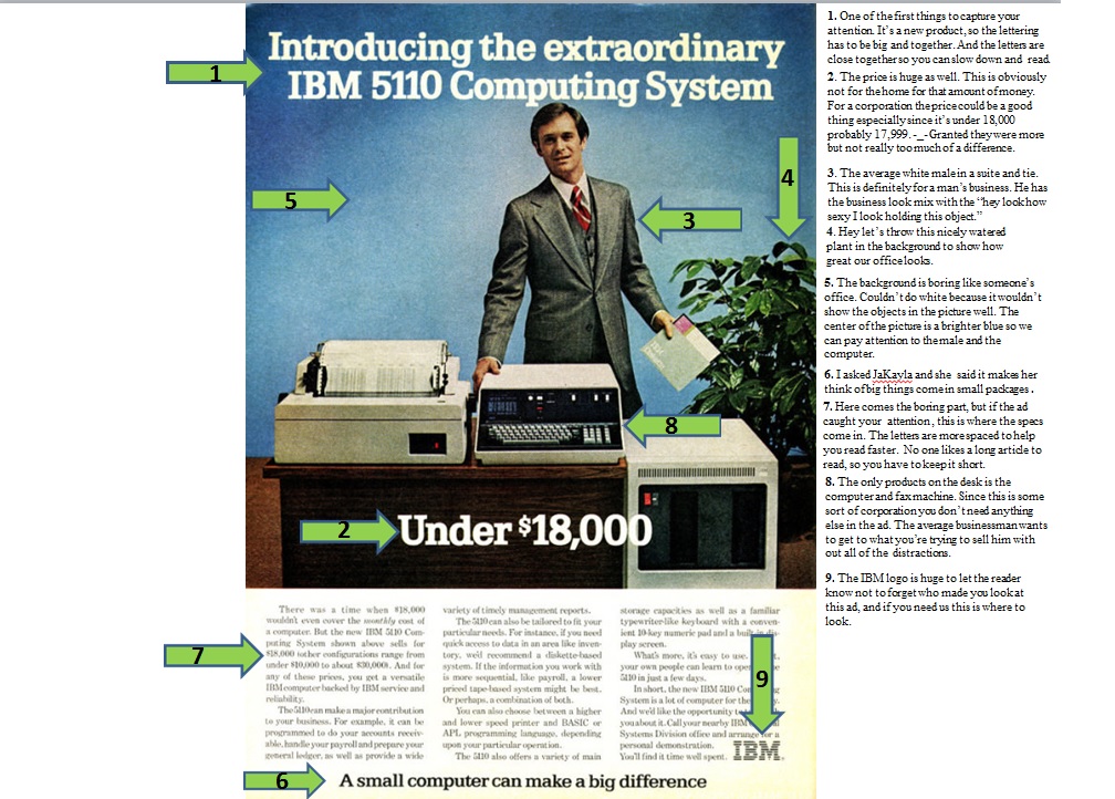
Yes, IBM is a
company which stands for International Business Machines. The name is too
long to keep writing over and over again, and to the average business man,
you need something short, quick, and simple, which will give the reader
patience to read the rest of the ad. Granted IBM are acronyms that have
always been used when dealing with computers.
|
Visual
|
|||
Color
|
Saturation
|
The purity or vividness
or depth of a color
|
The blue in the
background in the center has I would say moderate saturation. Since this is
trying to portray a basic office setting, the blue couldn’t be too dark or
too white. Although this ad is going for the basic look, there still needed
to be enough color to make the objects stand out.
|
Angle
|
Eye-level
|
Are we even with
them
|
When you first
glance at the ad after reading the big bold print, you’re most likely will
find yourself staring at the guy’s face. In order to capture the business
appeal, they put a guy who isn’t all the way smiling but not all the way
angry to target that particular audience.
|
Implied Distance
|
Medium Shots
|
Is the subject
people in interaction (waist up)
|
The whole point of
the ad was to show the computer. Since the computer is being advertised to
businesses all you needed to see was the top part of the suit to signal
business.
|
Type
|
|||
Style
|
Bold
|
X
|
All the words that
are needed to capture your attention are in bold. This allows the reader to
notice what’s being advertised before getting down the maintenance.
|
Great analysis. This advertisement, to me, looks like it could be making a statement about socioeconomic class. The massive price implies wealth (or the ownership of a successful business as you stated), while the suit the man wears seems to confirm this. It does not look like a working man's suit, but a manager's suit and fits well (as if tailored). It may also be making a correlation between technology and success. Just my thoughts.
ReplyDeleteI agree with everything in your analysis, I like how you expanded your thinking on the background. I like your point 3 on the picture analysis. I think an interesting analysis could come from there, like this idea that a "working man" is white, what's that say about society then and compare it to now. on a similar route, you could also talk about how this ad is picturing a "working man" but they're going to sit behind a computer all day, what about others who are laboring for a living? what's that say about peoples ideas of a so called "working man".
ReplyDeleteOverall your analysis is really great so far (thanks for the shoutout!) I think it's time to start honing in on the argument you want to make. I would say that the most interesting argument to be made here is the idea of corporate wealth and/or capitalism. I mean just imagine how much that same computer would be worth now.
ReplyDeleteI think you broke down the ad really well. Now you just need to find an argument that can go with the information you gathered. Somewhere along the lines of this is the perfect computer for a man about business.
ReplyDelete