Links to rhetorical tools:

Here are links to the rhetorical tools used in this class:

Schemes & Tropes -- Perelman & Olbrechts-Tyteca -- Fallacies -- Burke -- Rhetorical Toolbox -- Conspiracy Rhetorics

Wednesday, April 22, 2020

Mades de Plaza de Mayo

LAS MADRES REALIZARON SU MARCHA Nº 2181 EN PLAZA DE MAYO ...


The translation of the sign here is, “The revolutionaries in the heart of the village”. The sign has a play on words; looking at the sign, you can see the images of white headscarves inside of the shape of hearts. The white scarf is a symbol for Los Madres de Plaza de Mayo and is a way for the mothers to be connected. The placement of the white scarves in the hearts is symbolic for the revolutionaries being within the heart. It is also important to make note of the location of the protest and the building in the background. This picture is taken in Plaza de Mayo and the building seen in the picture is la Casa Rosada, or “Pink house”. The Casa Rosada is similar to our White House, in which it is the presidential house. This location is the center/ focal point of the city of Buenos Aires, or the “heart”. Thus, the protesters are truly in the heart of the village. Another note is that the text in this sign is all in one continuous line. The words could have structured into several lines, but by having the words in one line it extends the length of the sign and allows for more protesters to hold it and be together to show union. In the Text there is also no punctuation, no ending. The lack of punctuation and unbroken segmenting of the words shows that the protesting will not stop, but will be continuous, just as their walk around the Pirámide de Mayo in circles. The three colors seen are blue, white and red. Blue as a representation of sadness for their missing children, white as innocence as the children who were taken as well as peace for the peaceful protest of the madres. Red is also in the poster which shows their anger. There is Loci – quantity by having the “revolutionaries” as a plural term because there is power in the number of protesters.  The wording of “Los Revolucionarios” is also not gender specific, thus including both men and woman as the revolutionaries. The wording and location is also a usage of Presence – Space, in being in the heart of the city. Coexistance – Intention is used as the various acts of the people coming to support the mothers shows the unified essence. An accident in the poster is that everyone in the plaza at this time is a revolutionary. The poster and protests can also lead to bandwagon. Tourist can come and see the marching a decide to join even though they do not know the context behind the march.


MLK Keep Moving


This sign basically means no excuses. You can do anything you put your mind to, just keep moving forward and forget the past. For Schemes the words that relate to this sign would be diacope, scesis onomaton, anaphora, anadiplosis, antimetabole. Diacope, Anadiplosis, and Antimetabole are similar in this sign because they repeat the ending word as the first word in the next sentence. Scesis onomaton is another word I chose because the whole poster consists of adjectives and nouns. Anaphora is one other word I selected was because the sign repeats the words "if you cant." For Tropes, the words that relate to this sign would only be antanaclasis. Black and white are the only colors on the poster. The focalizers would be the words keep moving and everything else that is underlined. All the words are in all caps. The adjectives are the only thing underlined. Martin Luther King Jr's name is italic/cursive.

Rapists Cause Rape.


This sign presents a list of options to the question it is asking.  Here she is asking and then answering the rhetorical question with the right answer out of the list, this being an anthypophora.  The words are very flat making it easy to read everything on the poster and we can clearly see the color differences between the black and the more dominant purple.  The color difference is important hear because it gives us conection between the question and the answer, “What causes RAPE? RAPISTS”.  There is also a significant link between the words rape and rapists because of the use of all caps, adding an accent giving them even more definition and focus.  This again brings our attention to the two words of importance, which is somewhat of a repetition along with the question marks.  The words rape and rapists are very similar and almost the same word giving the poster the use of EpanalepsisThe image is very balanced and symmetrical giving us a feeling of stability and truth within the structure.  The list of potential answers to the question leads to a feeling of climax once we finally read the actual answer.  This listing is also part of an interpretation of specific choices where you have to choose between alternatives.  The answers themselves are an incompatibility because they are not the right choice for the question.  Using Paraprosdokian by putting the right answer last on the list, I think the woman creates the opportunity for the reader to rethink the question and really absorb the answer.  Lastly the whole march is based off of body taboos and the sign also touches on some.  Overall this sign is giving the reader the chance to come up with the right answer to an obvious question on their own, but if they can’t figure it out it’s right there for them in bold.  

Boys will be GOOD HUMANS


The person who made a sign took a twist on the saying “boys will be boys” and changed it to “boys will be GOOD HUMANS”. The original quote can be considered an epanalepsis since the word ‘boys’ is at the beginning and end of the statement. That original statement refers to the idea that boys can act like children, and it should be expected from them. To this day, it has become the idiom used an excuse for men of all ages and how they have unwanted or rowdy behavior.
The sign takes on a twist on this Idiom by showing that there should be a higher standard held on men to not act the way this epanalepsis insists they act, but to also be respectful to other people, especially females.

Tuesday, April 21, 2020

black power movement

Palatable Black Power Movement — Whether it was Asians, Whites ...
"The Yellow Peril (also the Yellow Terror and the Yellow Spectre) is a color-metaphor that East Asians are an existential danger and threat to the Western world. As a psycho-cultural perception of menace from the Eastern world, fear of the Yellow Peril was more racial than national, a fear derived not from concern with a specific source of danger or from any one country or people, but from a vaguely ominous, existential fear of the faceless, nameless horde of yellow people opposite the Western world."
"Under the leadership of the Black Panther Party and the Peace and Freedom Party, 5,000 protesters gathered in Oakland on Newton's birthday, February 17, 1968, in support of Newton. ... The phrase “Free Huey!” was adopted as a rallying cry for the movement, and it was printed on buttons and t-shirts."
Showing that the Black Power Movement was a movement that a lot of different races got behind and supported and did what they could to make a change by protesting. Also, that it wasn't just doing things for the black community, but for other races as well.
https://en.wikipedia.org/wiki/Yellow_Peril 
https://en.wikipedia.org/wiki/Huey_P._Newton

sign

View image on Twitter

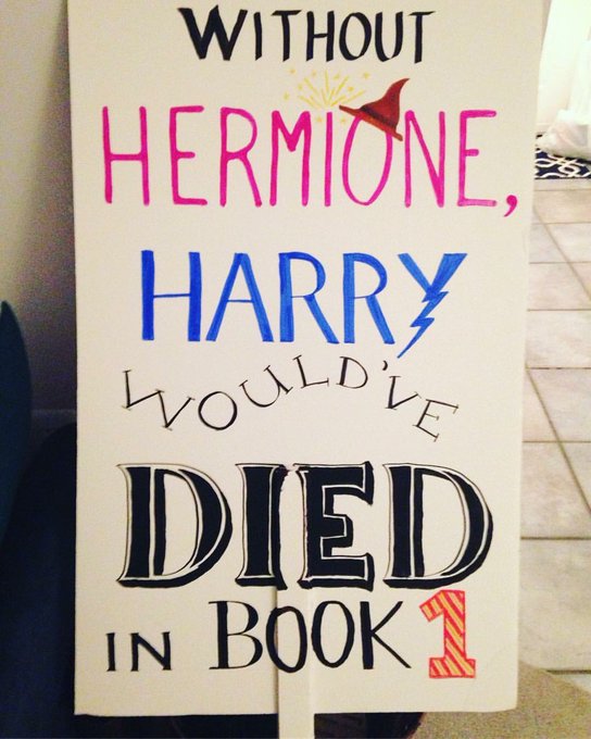
The person who made the signs used a very common movie that a lot of people know of to get their  point across that men need women just as people think women need men.
They used used different colors for the names and put the girl's name in pink and the boy's name in blue to help them stand out.
They used different fonts and all caps on the word died to emphasize it.
They used things such as a lightning bolt and a witch's hat, both things that you'd see in the movie to help better tie together the theme of Harry Potter.

American Indian Movement

American Indian Movement
I had a lot of problems finding any kind of signs that were worth a blog post so instead I am going to be using the symbol that was used during this movement. Above we can see many things such as color that emphasize the words as well as the hidden message behind them. Typically, as a culture we have valued red to be something of emergency, to stop and look at immediately. Using red in the lettering as well as the picture depicts emergency. Another underlying issue I think the creators did not really think about was the fact that "redskin" is used as a racial slur but here we can clearly see the native American as having red skin. This may have been to make the connection for others but the main purpose of the color red was to depict emergency. There is low contrast, not really any shadows but an outlining of the main three word "American Indian Movement" to make them seem more bold than they already are. Some focalizers in this image are obviously the Indian with the peace sign coming out of the top of the head to depict feathers but the way the main words are spaced out also preforms as a focalize. At the very top of the image is the word "American", this was done on purpose. I believe this was done to emphasize the fact that they were too Americans and were not being treated as such so to prioritize being called American first, they placed that word at the very top of the emblem. Going back to touch on the Indian head, this serves as a representational icon. Key symbols that call to mind a narrative that we can all identify for starters is the peace sign. This was widely used in the late 60's into the 70's and could be seen at many protests. This hand signal serves the purpose of the peace sign as well as completing the look of a Native American, with traditional feathers being placed in the hair. Overall, there is much emphasis on the "American Indian Movement" from the bold lettering, to spacing and even the color to depict emergency.

Amsterdam Squatters Primary Source Analysis


In this banner from the Amsterdam Squatters protests there is a rhyme with the "say" and "stay".  The use of the rhyme makes the words on the banner stick in the reader's mind. It is impressionable and to the point. While is particular image is in black and white, the banner seems to only consist of two to three colors. After further research, many of the other signs from the protests are in black, red, and white so I'm assuming that's probably the color scheme for this banner as well. If so, those are bold colors that stand out as well as give off a vibe of seriousness, especially with the color red. The use of all capital letters and in bold is demanding and lets the read of the banner know that the protesters are not budging on what they desire. The words themselves are an Example in Establishing the Structure of Reality. The text is saying that no matter what the event is, squatters will still stay in the places they are at. This is the rule, that squatters will not give up no matter what people say. The text is also an accident fallacy because is says that no matter what they say, the squatters will stay, which means that even if there is a solution found for the problem, the squatters will stay where they are at. There is no exception to the squatters staying in place even if there is a solution that will help them out to find a better home because it doesn't matter what is said. 

YOU'RE SO VAIN. I BET YOU THINK THIS MARCH IS ABOUT YOU. (SIGN)


This sign is a turn of phrase from Carly Simon's song, "You're so Vain." The tune itself is about a self-absorbed partner for whom it's said he's been so vain, he actually thought the song was about him. As for this sign, trump is the self-absorbed "partner" and this sign presents people who feel like they don't have a voice against politicians who do not agree in what they're fighting for but this gives them an opportunity to share their voice. The words of this sign were something from a popular song that many people could relate to and link it to back to our government with meaning.

Sunday, April 19, 2020

The Handmaid's Tale *** possibly triggering items in the description


For those who have not read The Handmaid's Tale and or seen it, basically  it is about the government  having control over all women. If the women cannot be submissive, speak only when they are spoken to, give birth etc. they will killed and or brutally punished. There is a mass number of hangings of those who do not abide by law, and beatings for those who do not listen. The women of Mexico attempt to do their daily routine in fear of being kidnapped, mutilated, and victims of sexual violence.  Some may never be found, some have been found dead, and some have had their cases destroyed by the government and officers taking advantage of women. The cases of domestic violence also play a number in this, the fact is women do not seem to have the slightest right.  most of this is happening along side the Cali/Mex Border

Saturday, April 18, 2020

I am very upset


I would say that this is an example of the trope litotes because it is an extreme understatement of the feelings she is really feeling for effect. Although she mentions that she is upset, there are probably a lot of other thoughts and feelings she is thinking, but chooses a simple choice of words for the effect, rather than expressing the specifics. It works though because it's pretty funny in my opinion and also caught the attention of others, enough so for someone to take a picture of it. Sometimes less is more, and that is the case with this example of litotes.

We Were Served A Lemon


Sorry in advance if this offends anyone. I love the way this sign look. You can see all the imagery it has. "We were served a lemon, but we'll make lemonade," this means that we can take whatever obstacle he throws at us. The hands represents the nation, and that if we stand as one, we can take him down. For Schemes, I think this sign relates to only enumeratio because the sign is dealing with a cause and effect scenario. For Tropes, I think that prosopoeia would be used in this sign, because the lemon that is in the word actual word lemon is supposed to be Donald Trump. The hues for this sign would be different shades of purple, yellow, and white(for the font). The purple that is the background of the sign is low value. The hands that are colored in the different shades of purple are anywhere from middle value to low value. The lemons are middle value and high saturated. The sign is very well balanced. The focalizer's would be Trumps lemon head, the lemons, and the hands that are holding the lemons. The sign is eye level. All the writing that is on the sign looks like its bold, but the word lemonade is italic. Overall I like how the juice is coming out of the lemon head of Trump, you can get a sense of bravery and anger out of this sign. Well at least that is how I feel.

sign?

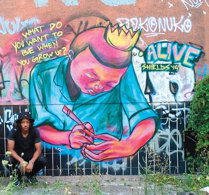
Street artAlthough this is not a actual sign but its a sign showing that graffiti can speak in many different languages. This art was done by a man named James Shield, he was inspired to do this after an unarmed black man was shot. He started doing painting where black people had crowns on with saying like "America, stop killing black kids". "Don't go , they'll shoot too". Then is this photo "what do we want to be when you grow up, ALIVE." Showing that graffiti can express a lot more then you think, different culture different ways of looking at the art and showing that it could help understand what's going on around you. Graffiti can express different perspectives and showing that art can help someone understand that you do have a voice and can make a change.

"We Can Do It" Poster

I did not notice at first, but then I was like, "Oh cool! I get this reference!" lol. In all seriousness though, this poster, first of all, represents Rosie the Riveter. She was an icon for women during World War II, which was a really empowering time for women as they started to work in jobs that typically only men did. This is something else though that is unique about this poster and that is the fact that it has Emma Watson at the face, who played Hermoine Granger in Harry Potter. This is reinforced by the wand in her hand as well as the Deathly Hallows faintly in the background.

This represents women as powerful and smart figured, hence the combination of two prominent female icons that represent women positively. The Granger/Riveter amalgamation uses a geometric perspective to not only make her look more real but also seem more defined and muscular as well. While I would not say the space is exactly fully open, there is some to the right of her and this was partially filled up with a transparent Deathly Hallows. The biggest part, no surprise, is the fact that these two characters are icons as they support a powerful narrative about women. We can see that Rosie the Riveter is not being replaced by Granger, but she is being more modernized to help people today better understand the context of what Rosie would've represented in WII. This was my favorite picture out of all of them and I think the clash between historical value and present-day fictional value blend together well to create a great visual representation of just how powerful women can be.

Friday, April 17, 2020

So bad, even introverts are here.

View image on Twitter


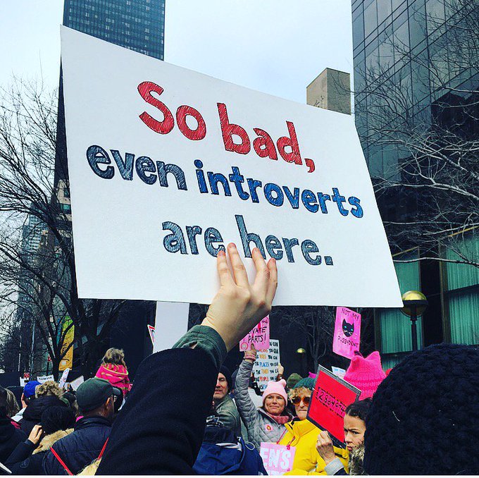
With this sign we are able to see isocolon parallelism in the form that there are two words per line. We are also able to see that the spacing between the letters are close to each other. The parallelism and the spacing allude to the idea that the marchers are all standing with and side by side one another. Another spacing technique used is the use of open space on the poster, the top and sides have open space. The words are also written in bold lettering. These two devices are showing the the woman are there out in the open and speaking up boldly for what they believe in and are strong in their beliefs. There is an emphasis used as colors on the words that are red and blue which are written on a white poster board, thus including the patriotic colors of the United States. There are two different blues used in the poster, a darker blue is used to color in the word "introverts". The difference in colors is to create an accent on the word "introverts", however, there is a low contrast between the two blues creating a weak accent on the word because there is not much distinction. The words are also outlined in black to make it easier for readers to read. The premise of facts are used in that it is a fact that introverts don't enjoy going out in crowds. The poster writer created an antithesis balance of a juxtaposition of introverts going out to a large crowd/march. This is then a succession of waste showing that this is important and very bad and the introverts are making the sacrifice to get out of their comfort zone to go protest. The poster all in all is well and gets straight to the point, however is does make a hasty generalization that all introverts do not like to go to rallies.

I luv naps but I stay w o k e


The word "woke", has been used to mean "conscious" in black culture since around the 1960's and 70's, and has recently, in the past decade or so, been popularized and adopted by mainstream American culture. Usually, woke entails a progressive stance, or one aware of  negative issues in society or the political powers that be that are deeper under the surface. In the case of this signage, the small child, who likely enjoys taking frequent naps, as many toddlers do, but the sign plays on the idea of him staying awake, using the word woke, to imply that he is aware, informed, and cares about women's rights. The emotional appeal of a cute little child, and the cute humor of the catchphrase on the sign, helps to disarm and win over viewers of this image. I think even people opposed to women's rights would likely be more sympathetic to this small child than they would have a grown women saying it, even though the sign may have been made by a grown woman.

Sign


This sign refers heavily to the use of Twitter during this movement. The most obvious aspect,
aside from the blue and white color scheme the social media platform uses, is paronomasia.
Paronomasia is a type of pun where two similar words with different meanings but different spellings are
interchanged. The word "Tweet" in this case can be read as a mispronunciation of "Treat", which
creates two different ways to read the sign, both making sense for the cause the woman is marching for.

Social Movement Signs, Babby


In this post, I’ll be talking about the women’s rights protest sign in this image below.


There are layers here. First of all, they used color to cast emphasis onto their message with white font on a black background, an easy-to-read font in all caps, and some snowflake icons around the word “BLIZZARD.” The color contrast is important because it draws the eyes to this sign, and the all-caps basic font is important because it makes it easy to quickly read, which is great for when you’re in a crowd of moving people and being read at varying distances. At events like these, a solid quick-to-read sign can help spread your message further and to more people. The snowflakes are used to represent the unity between the protesters, if not all people who are fighting for human rights. If you’re going to call them snowflakes then you’re going to have to deal with an army of them, Hence, the “BLIZZARD” pun. I love so much that this is an angry pun. Sometimes humor can be a great way to deal with horrible things, so why not a pun? After all, if the people this protest opposes will cringe at all the “snowflakes,” then why not say “call me what you want, we won’t stop and we’ll make as many puns as we want” as they cringe at the pun as well? Inflict a double cringe. Critical damage to the opponent. Huzzah for puns! Although, I think that there’s also a certain amount of irony in this sign. However, it’s part of an overarching irony that encompasses the entire term “snowflake.” I mean, who’s the one melting down about people asking to be treated with equal human rights? Who’s the one who takes personal offense at that and makes a big angry deal of it? Because, look at this woman. Not screaming and having a meltdown, even though she’s in a group with violated rights. Just calmly smiling, sharing her message while using an expression that people use to imply that she’s constantly breaking down.

What do we Want? Sign Analysis


The use of the two different colors (black and red) shows the questions that he wants answered (in black) and the answers he wants (in red). The use of all capital letters in the answers shows that these things are very important to him. Also the use of capital letters in the questions gives them a sense of being a title and titles are important as well because they show what a text is all about. The use of a familiar saying on the poster is a little bit humorous and clever and allows the reader of sign to be draw in and relate to the sign and the boy's desires. The sign is very legible and easy to read even from a distance. The use of w's is an alliteration and makes the sign easy to read. This boy's sign is short, sweet and to the point, and he achieved that through the use of the two colors, alliteration, capital letters, and legibility. It is also inclusive which allows people to relate and connect while the people who are being protested against can see that the people are protesting together for a common answer and cause. 

Monday, April 6, 2020

Social Movements to Pick from, 2020

You can pick any movement, not just these. The links here are to academic sources that will give some details and analysis and suggest a place to start as you look for texts produced and performed by your movement. Remember, you are not analyzing these articles. You are analyzing primary sources from the movements themselves. This is just a head start on your work for you.

You can pick other movements, as well. When you sign up in the comments, just be VERY specific so that people know what you are doing. Do not, for example, say "feminism." Well, that covers a lot of individual movements people could be analyzing.

Use the comments to sign up for movements. CHECK what other people signed up for. On the last assignment people didn't check and signed up for the same things.

You can use the "social movements" labels on the left side here to see how students in previous years worked with their data. Note: Feel free to utilize good ideas from students who analyzed the movement you are choosing, but be sure to cite their work in your own work. Consider those students scholars you would cite. Some day the same might happen to you with your work on this blog.

1. Black Power

2. Amsterdam Squatters

3. Post WW2 Japanese Pacisfism

4. Save Darfur

5. Australian Women's Movement

6. East Germany, 1989

7. Royal York Strike

8. Knights of Labor, 1880s

9. Hugo Chavez

10. Free Chol Soo Lee

11. Argentina's Piquetero Movement

12. Queer Nation San Francisco

13. 2000s Feminist Anti-War Movement

14. Solidarity

15. Black Lives Matter

16. Occupy Wall Street

17. WTO Seattle

18. United Farm Workers

19. Anti Prop 8

20. Quebec Student Strike of 2012

21. Australian Community Radio

22. Urban Knitting

23. J14

24. Umbrella

25. Egyptian Arab Spring

26. Gay Marriage

27. SlutWalk

28. SafeGround Sacramento

29. Young Lords' Garbage Offensive

30. SDS

31. MLK

32. British Suffrage

33. Pernicious Literature Campaign

34. US Anti-Nuclear Movement

35. Vietnam

36. Gezi Park

37. Anti ACTA

38. Soulforce Equality Ride

39. American Indian Movement

40. John Birch Society

41. Alt-right White Nationalism