Links to rhetorical tools:

Here are links to the rhetorical tools used in this class:

Schemes & Tropes -- Perelman & Olbrechts-Tyteca -- Fallacies -- Burke -- Rhetorical Toolbox -- Conspiracy Rhetorics

Monday, January 25, 2021

Ad #9 analysis - J.L

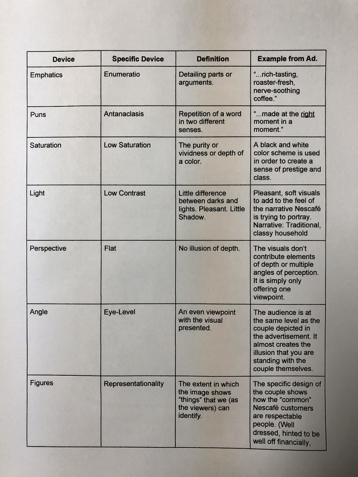
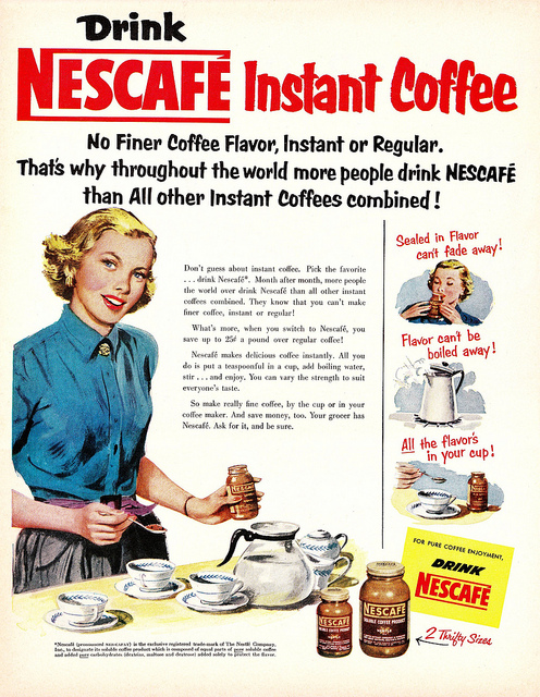
    This NescafĂ© ad, whose target audience is middle-class women, aims to convince such target audience of the superiority of instant coffee, as opposed to regular brewed coffee. It attempts to do this by suggesting that by choosing instant coffee - more especifically NescafĂ© - one will, amongst other things, always be prepared to receive guests with hot, delicious coffee. Another major selling point is that instant coffee makes less of a mess, and thus, requires less cleaning. 

    The ad was designed with stylized fonts that range from bold lettering, to all caps and italics. It uses these styles in order to captivate the attention of the audience, ensuring that if such audience will not take the time to read the whole ad, they will at least get the most important message that the seller is trying to convey: delicious coffee that is easy and quick to make. 

    It becomes evident that the seller also intended for the visual aspect of the ad to be an impactful tool when drawing the audience's attention. The use of bright colors is evident, but the most important message lies wiithin what the image was intended to represent, that being the happy ladies serving two handsome man the instant coffee, satisfying the trend of using female stereotypes in order to sell a product, something so common during the 1940s-60s. 


ad #4


Chase & Sanborn Beanz #6


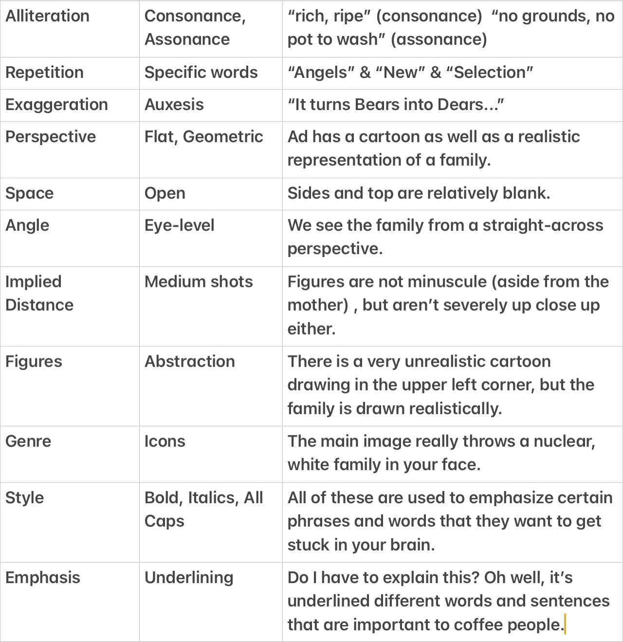
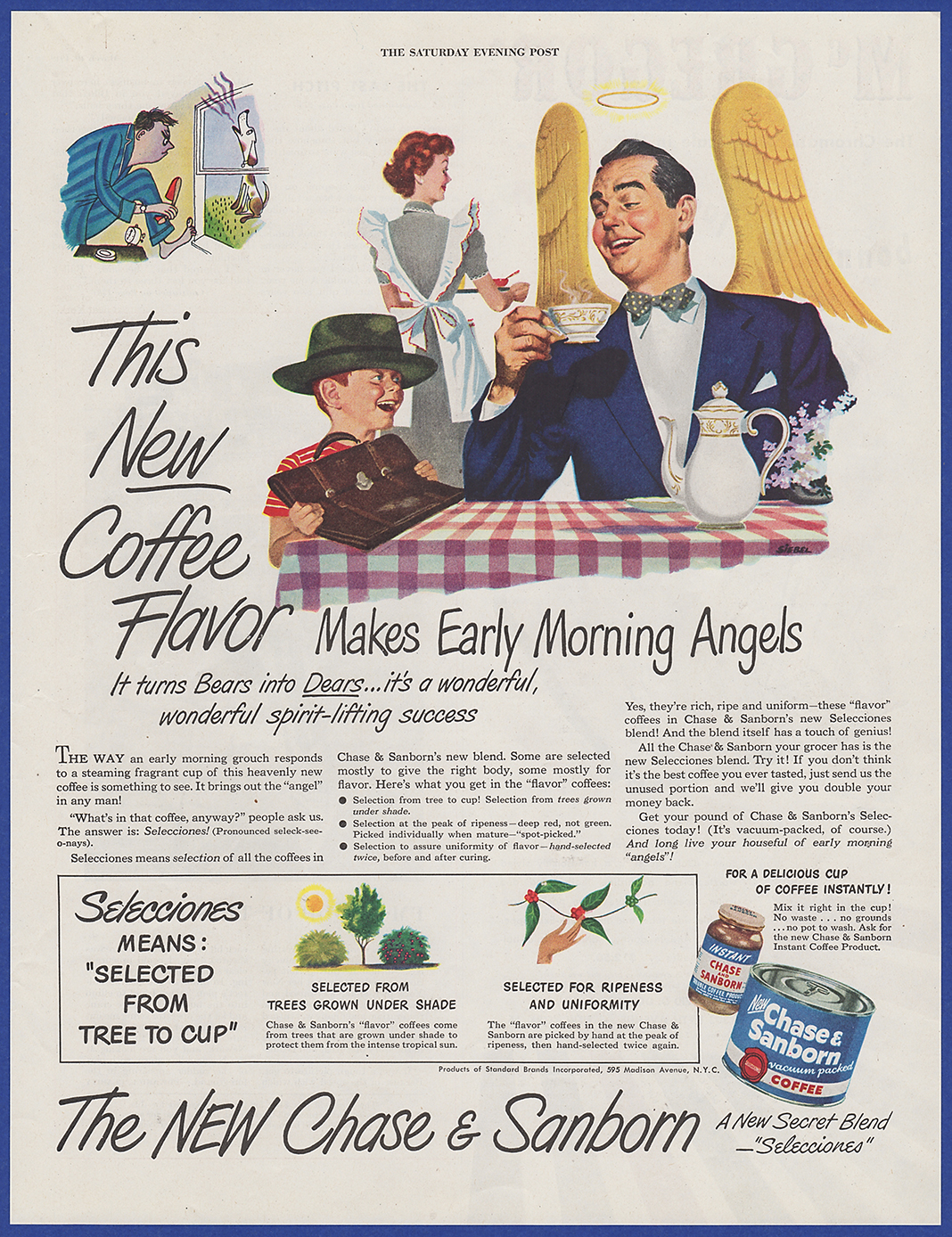
    Lots of things are going on in this particular ad, but the certain repetition of words and style of the text has a lot to add to the overall influence. The imagery that these words and pictures are trying to conjure in your head is trying to make it stick with the viewer and make it more relatable to daily life. My analyzation of this ad covers lots of topics and ways that these coffee people, Chase and Sanborn, are trying to appeal to your mind.  


As I went down the list, the first thing I found in this ad was alliteration. We have consonance and assonance, the consonance example being “rich, ripe” and the assonance example being “no grounds, no pot to wash”. Rich, ripe is a repetition of “r” and is a catchy way of explaining coffee, making it seem appealing. Who wouldn’t want something rich and ripe? As for “no grounds, no pot to wash”, this one is using an “o” or “ah” sound to make the words seem a little more emphasized. 

I couldn’t find a precise branch of repetition to work with, but that didn’t stop me from noticing three main words that chase and Sanborn were trying to get you to remember. “Angels” is repeated three times throughout the ad, and I think it is attempting to appeal to women with the idea that their spouse would be more “heavenly” if you will, because of this coffee. 
“New” is repeated quite a few times within this ad, and it is pushing the idea that this particular brand has a new and fresh recipe that could potentially be better than other brands. This repetition of “New” is later emphasized with all capitals and even underlining which I will touch on later. 
“Selected” is repeated in a little rectangular box near the bottom of this ad. This is reminding the viewer that this brand of coffee is carefully chosen and picked for the best and most robust coffee flavor, so it is seen as more superior.

An exaggeration that I found within this ad is the sentence, “It turns Bears into Dears...” Which really confused me because it doesn’t rhyme. However, this is an exaggeration in the idea that men are not animals, but their moods could make them seem as such. What better way to lift their mood than a nice cup of coffee in the morning to turn them into a “dear” or “angel”?

Now let’s get into the visuals of this ad. As I was going down the list, perspective jumped out at me. Within this ad there are a few different styles of visual representations. There is a very cartoonish picture at the top left that isn’t realistic at all, and I would classify that as flat. However, There is also a large visual in the middle with a pretty realistic representation of a white family having breakfast. So I had to use flat and geometric to describe these two visuals.

Next we have the open space in this ad. The top and sides around the visuals are pretty blank, so most of the attention is focused on the center and all of the words and pictures within.

The angle of the visuals in this ad is at eye level, because we see the family straight on rather than from above or below. I think that this may make the viewer feel more connected and relate to the family in the ad even more.

The implied distance that the viewer gets is a medium shot. We are not hyper focused on a zoomed in picture of somebody, and we are not seeing the people from afar. I think that this gives a sense of comfort to the viewer. The ad is not in their face, but it is not distanced from them.

For figures, I decided that abstraction was a good representation of one aspect of this ad. In the upper left corner, there is an unrealistic cartoon of a man holding a shoe angrily while a dog howls in the background. This is the only abstract piece of this ad, and to be honest I can’t particularly figure out why it was thrown in there because the ad still does it’s a job without it. If anything it adds a sense of confusion and question. 

For genre, I chose icons because the main image in this point of this ad hurls a nuclear white family into your face. One where the woman is in the background, and the dad is sitting with the kid at a table with a cup of coffee. I feel that this appeals to anyone in  a family because it represents all of the members of a nuclear family.

In style, I found bold, italic and all caps words and phrases. These all had their own job of emphasizing certain aspects of the ad. Bold words drew viewers eyes to the main phrases within the ad. Anything that was italicized was also very large, and it was mostly reminding the viewer that there was a “new” coffee. Any words or letters that were capitalized were emphasizing information to the viewer, so that their eyes would be drawn to important information about the cultivation and growing process of the coffee.

For emphasis, I found words that were underlined. Weirdly, there were only two words that are underlined. “New” and “Dears”. I think the “new” is pretty self-explanatory, but I think the reason that “Dears” was underlined was because this ad is mainly targeting people who are in a family, but also the wives that are in a family. If this coffee can make your husband more polite and bearable, then who the hell wouldn’t want to buy it. 


To conclude, there were a lot of big and small pieces of this ad to take apart, but the overall message was trying to prove to the viewer that this coffee can cheer anyone, even your husband up. It was also trying to accomplish the fact that their new recipe was innovative, specially selected and successful.


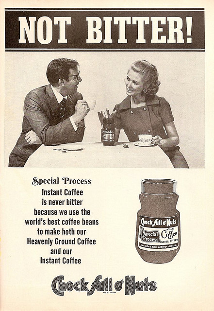
#25 "NOT BITTER"


Ad #21 analysis


When Lightning Struck My Neighbors House Coffee Ad #17

 This ad begins with a sudden emergency as a neighbor's house is hit by lightning. The ad goes on to reveal how one needs to make coffee throughout day to day life as the neighbor comes to her house to make coffee. Furthermore, the idea that coffee can be beneficial at all times is shown through the first woman going to make coffee right after her house had been struck by lightning. The ad also alludes multiple times to Folger's "mountain-grown" taste. This alludes to nature and introduces an ideal that the coffee is both fresh and as natural as coffee can be. The ad then shows the woman serving coffee to her husband, appealing to a wife as a way to satisfy her spouse. The ad concludes with another picture alluding to the great taste of Folgers that separates them from all other coffee companies


Schemes and Tropes: An Analysis of a 1940's A&P Coffee Ad


In this A&P Coffee ad, the focus is emphasized that the problem with your unsatisfied household isn't because of your brewing technique, but your coffee. 

The use of bright, eye-catching color is used to draw you to what their brand looks like. They also use alliteration and italics to emphasize that their product is better, fresher, and the best pick of the plantation. Quit disappointing your family with bland coffee and get A&P freshly ground at the market, and get it customized to your coffee pot.

I wonder however, is the ad truly directed to the woman of the household, or is there an underlying message for the conventional "man of the house"? Could this be an ad stating "Don't blame your wife"? The distain in the woman's eyes says that she was scolded for the poor coffee, and no man wants an unhappy wife, so could it be so that the man can address the issue and make a request for a different coffee brand?


Device

Specified

Definition

Ad Example

Style

Bold

Font that has a strong appearance.

Bold header “DON’T BLAME THE COFFEE POT!”


Italics

Sloping typeface used for special emphasis.

“the pick of the plantation”

Implied distance

Medium shot

Is the subject people in interaction (Are they about waist up?)

We only see the people from the waist up

Emphasis

Color


Bright color is used throughout the ad to draw the viewers’ attention to certain areas.

Focus

Focalizers

Are figures or colors or spaces used to pull the eye across the image?

The woman, specifically her face, and the coffee bags are the main focus.

Angle

Eye-level

are we even with them?

We are eye level with the people

Figures

Representationality

to what extent does the image show” things” we can identify?

The ad insinuates that without A&P coffee, your family life will be unhappy


Color

value

The lightness or darkness of a color

The colors have a wide range of value


Saturation

the purity or vividness of depth of a color

There is a depth to all color

Light

High contrast

Bright lights and dark shadows

High resolution shadows contrast to the brightness of color

Perspective

geometric

An illusion of depth and space

The woman is sitting across from the table.

Repetition

Epistrophe

repetition of words at the ends of successive clauses

Repetition of the phrase “coffee beans”

Alliteration

Consonance

Repetition of consonant sounds

“Fresher, finer flavors”

“Pick of the Plantation”


Devices, Figures, Schemes and Tropes (Ad. #22)


NESCAFE COFFEE AD

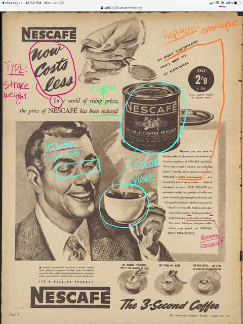
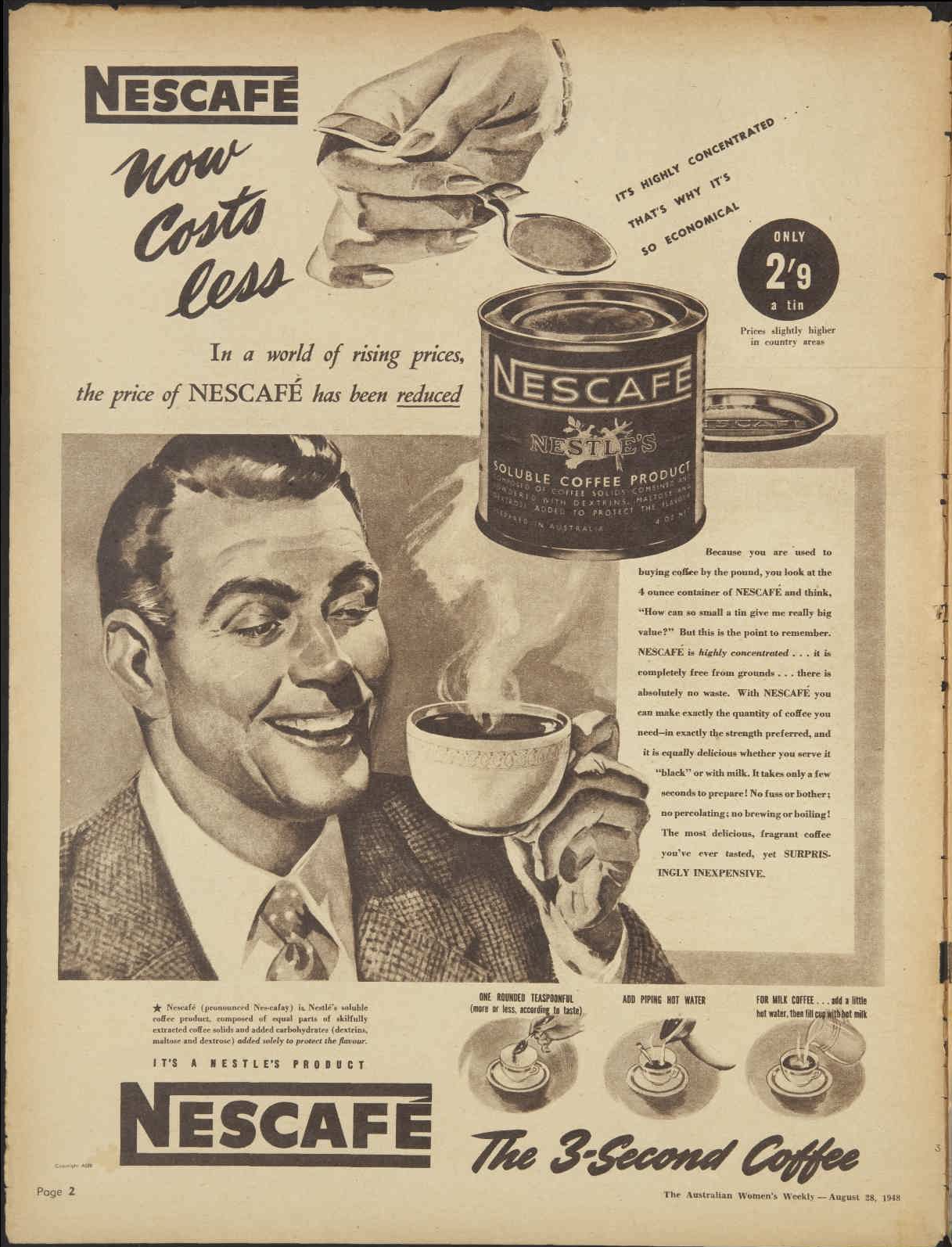
In this ad NESCAFE – focused on saying that while prices in the economy are rising, their brand has reduced their prices. They used repetition a lot to draw your attention to specific words. For example, they use the phrase “highly concentrated” at least twice in this ad to let you know their coffee is highly concentrated!! Why is it so important the readers know that? Because they are selling a smaller item and want you to think it has more value than their larger size.

They used alliteration to create a catchy sentence at the end of the ad so you remember it. “..no brewing or boiling!” 


TYPE

 stoke weight

How varied are the weights of the different strokes? (What are the thickness differences between various marks in a letter?)


                SOME OF THE TEXT IS IN BOLD

WHILE OTHERS ARE IN SMALL PRINT

REPETITON 


epistrophe

Repetition of words at the ends of successive clauses.

REPEATED USE OF “HIGHLY CONCENTRATED”

COLOR 

value

The lightness or darkness of a color.

THE CAN IS VERY DARK ON THE PRINT IN CONTRAST WITH THE LIGHT SMOKE FROM THE CUP AND THE CUP IS VERY LIGHT. 

arrangement

climax

Ordered by increasing importance.


WHILE OTHER PRICES ARE INCREASING 

WE REDUCED OURS – CLIMAX IS THAT THEIR PRICE IS REDUCED INSTEAD OF INCREASING.


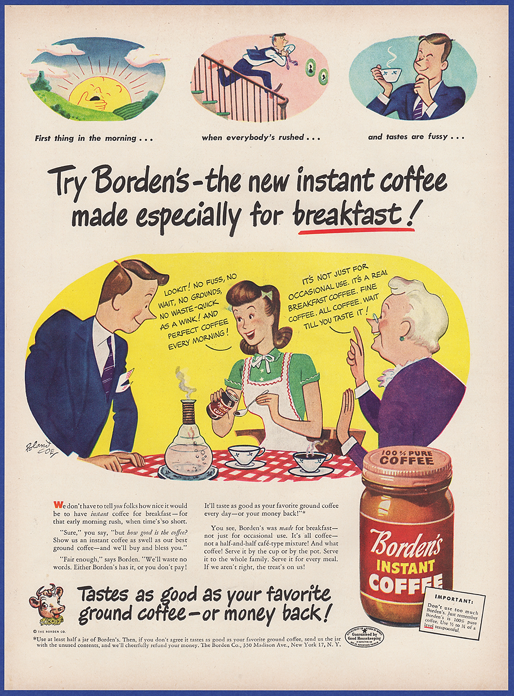
Trevor Nealeigh- Borden's Instant Coffee Ad Data Blog Post


Nothing satisfies like coffee AD #2

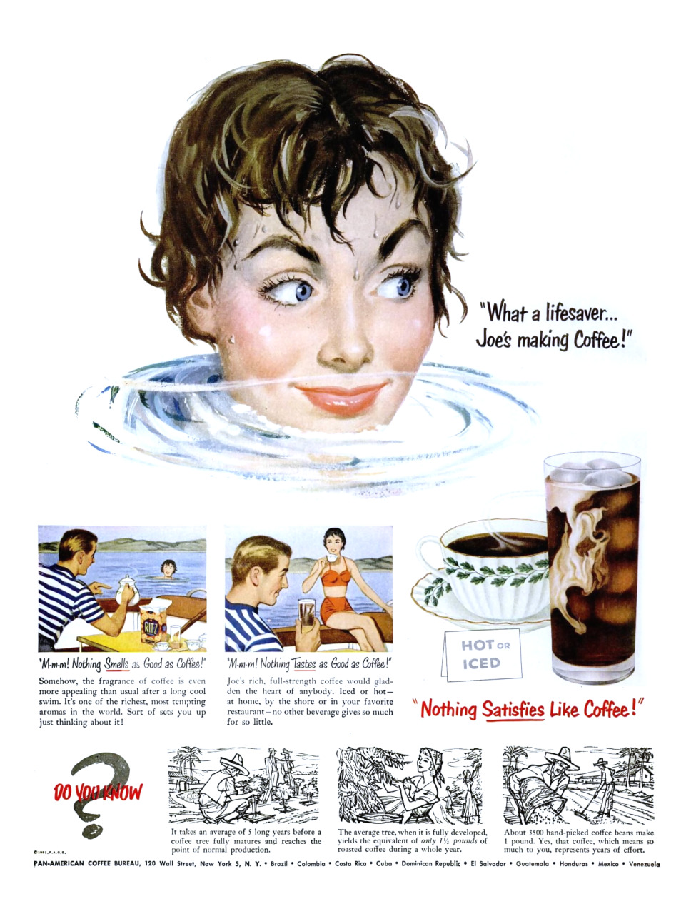
In this short ad about coffee, they are using a man attracting a women on his boat to get her to come get the coffee from him. They are using adjectives like "smells" and "tastes" to show how good the coffee is. They are using the man and his boat to bring in the girl that is swimming showing that the girl must really love the smell of that coffee to bring her in so easy. They use strong smells and tastes to show how good this coffee actually tastes. At the end of the ad they make something very important that makes this ad stand out from the rest of them, they use facts about how coffee beans are picked everywhere and where this coffee actually comes from. This engages the reader's eyes because he now knows that the coffee is coming from hardworking men and women that pick these coffee beans. Using these facts at the end of the ad engages the readers eyes to want that coffee that much more because he knows where it's coming from. This ad contracts the readers eyes very well. 

The girl at the top is used to draw the readers eyes

What a lifesaver makes the reader want the coffee

At the bottom of the page they use facts about coffee to show the reader what they are actually getting

Leads the reader to believe that coffee is the key to success


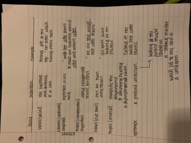
Device                                           Definition                                               Example

Epizeuxis.                                     repetition of one word.                           Satisfies they use to bring in

Assonance                                    repetition of vowels                                They use joy as a vowel

Saturation                                    purity of color ness                                  Many bright colors are used 

Value                                            light or darkness of color                       uses both bright and dark colors

Focus.                                         uses color to draw in reader                    They use the dark coffee                                               

Wednesday, January 13, 2021

Ads to Choose from for 2021 1940s-1960s Coffee Print Ads

To choose, you must "call it," first come, first served, by commenting on this post with the number of your choice. Be sure to look at all the comments before you do so, as calling an ad that is already taken is invalid. Everyone must choose a unique ad.

1. 1948 https://c2.staticflickr.com/6/5035/5826909415_5df150f695_o.jpg

2. 1951 https://64.media.tumblr.com/bd610157be2275a1d1a53bb3bf41bc14/tumblr_pelthih44B1tsaeqzo1_1280.png

3. 1945 https://i.pinimg.com/originals/7e/9a/c0/7e9ac01d03ba28bb6ba1b7aeeb230482.jpg

4. 1950s? https://flashbak.com/wp-content/uploads/2018/08/11-vintage-coffee-8-1200x1633.jpg

5. 1952 https://flashbak.com/wp-content/uploads/2018/08/13-vintage-coffee-3-1200x1637.jpg

6. 1940s https://i.frog.ink/2eynH7mf/ads03.jpg

7. 1950s https://i.frog.ink/agNsqwWo/ads07.jpg

8. 1948 https://ia801708.us.archive.org/17/items/1948-advertisement-for-nescafe-coffee_202011/1948%20advertisement%20for%20Nescafe%20coffee.png

9. 1940s? https://i.pinimg.com/originals/69/de/c1/69dec1dc822e23d9fd237292281b9af1.png

10. 1948 (Australia) https://ia801700.us.archive.org/13/items/1948-advertisement-for-bushells-coffee_202010/1948%20advertisement%20for%20Bushells%20Coffee.png

11. 1940s https://i.pinimg.com/originals/a4/fe/7d/a4fe7d060d10880ecc5eb38cfa80a65e.jpg

12. 1940s https://i.pinimg.com/originals/c2/87/6e/c2876edac2c11d7ffe193d1e7881b999.jpg

13. 1951 https://parade.com/wp-content/uploads/2016/09/CoffeeSatisfies-7-15-1951.jpg

14. 1940 https://blogger.googleusercontent.com/img/b/R29vZ2xl/AVvXsEjvBU6yaTH83rEOw9uh9YkxhVkTkiP16n7Q7rYNREw3kaqkIrwlEiFGbxAEJd-EWEsvmknxxKkq-_99aSd8peBZiF_5OXgmSGTPvCX5VMqhxWwIz4E_mQoeLK0pij7tunDJFinBlH00Y2k/s1600/ap-day-05-01-1940-998-M.jpg

15. 1940s https://i.pinimg.com/originals/68/43/73/684373bbabbede12b28eda46c51c35ae.jpg

16. 1950s? https://ic.pics.livejournal.com/pikkewyntjie/26922831/180948/180948_original.png

17. 1950 https://www.esseloncoffee.com/wp-content/uploads/2016/12/Folgers-2.jpg

18. 1960s? https://i.pinimg.com/originals/24/96/3e/24963e48e368fc55d781916c99c84d4b.jpg

19. 1960s https://blogger.googleusercontent.com/img/b/R29vZ2xl/AVvXsEhk5A9eBmIYbaUywJYVkB48R-rNVZeF50iBYHRLvrO6tAXHxUNJLhWrZPW0OE5ZEAUd4i7i2hPMhhmCxLEG9E3WnyuS7LJtIj2D7uJ2UCWmM0NGgEkmVi1uUw7QZhH8W-HDOEHMpyplMec/s1600/images60sanka.jpg

20. 1960s Australia https://flashbak.com/wp-content/uploads/2018/08/10-The_Australian_Womens_Weekly_04_12_1968_0119.jpg

21. 1950s? https://blogger.googleusercontent.com/img/b/R29vZ2xl/AVvXsEgLgPeEkg4_tLnY-LBijwHE6CtwK3Sa5imi-oYV-lcf6bww6Lp8pLTM4Bx3u9jQqgXEGcrgr10dW3RtfTdIVCE0lApTSHRYr0xKxtTo4LQ7KVU0EWu5VuM1G6OKF6BXeCB37_JPqV2owlk/s1600/Vintage-Coffee-Ads-Nob-Hill.png

22. 1930s? https://blogger.googleusercontent.com/img/b/R29vZ2xl/AVvXsEgxqzpgCI83PFWsdbCJNtzfZAYvUqakqvRf8RDR3rPHvVt7vi4cP4LzTTTy3rXchsdw99sKU2qIZPJeYuaLCGEp1FlA6oMc_XYBh_O13UlnODNqQZvNLYYsPhsigaa_B0l44HOMoagf1Uc/s640/c04ec317a1fef023257b730dd715f099.jpg

23. 1930s https://i.redd.it/q6xp0pmwap551.jpg

24. 1940s https://www.saturdayeveningpost.com/wp-content/uploads/satevepost/1940_11_02-093_SP.jpg

25. 1930s https://lh5.googleusercontent.com/_wYTUD4CnYhc/TZHl4wAgluI/AAAAAAAAdXM/v02PjK0j3Y0/s800/not%20bitter.jpg

26. 1940s https://lh5.googleusercontent.com/_wYTUD4CnYhc/TZHlquOZGoI/AAAAAAAAdV0/BOYa6VEFAgw/s800/nescafe%20no%20finer.jpg

Thursday, May 7, 2020


The United Farm Workers flag has a storied history, from humble beginnings as a symbol of the fight of migrant California farmworkers under Cesar Chavez to becoming a unifying symbol of “La Causa”. The United Farm Workers flag transcended its original purpose, which was likely more short-sighted in its approach and ideals, into becoming  a general unifying symbol for all chicanos, regardless of occupation.
The color choice on the flag is decidedly provocative, and the first symbol that would come to the mind of many on first impression is that of the Nazi Swastika, and although the goals of these causes are radically different, I don’t believe that the creators of this flag adopted a color scheme reminiscent of the Nazi symbol by coincidence. I believe that the shock value of the similar color scheme in their logo was a strategic choice in order to catch the eyes and attention of the media, in order to have their message taken seriously. 
In time, the image of the black eagle became a symbol of cultural pluralism, a
flag for disenfranchised Mexican-Americans to fly and feel as if they truly belonged, as they had for years been outcasted from American Society, and had strayed from their Mexican roots to the point where they no longer felt as if they were Mexicans, nor did Mexicans accept them as their own.
The flag was created in 1962 by Richard and Manuel Chavez, brother and cousin of Cesar Chavez when he and Dolores Huerta founded the National Farmworkers Union, an early conception of the United Farm Workers. The marches under Chavez being planned needed a symbol to rally behind, so Cesar recruited Richard and Manuel to design their flag, who supposedly sketched the first iteration of a flag design, which would end up becoming the adopted symbol, on a brown paper bag. 
According to United Farm Worker legend, each color on UFW the flag chosen holds a symbolic significance and relays its own message in it of itself. Richard and Manuel chose black to represent the dark, grim plight the farmworkers faced under white supremacy, white to signify an innocence and hope for a brighter future for the union workers, and red to represent the blood of those union workers who will likely sacrifice much in their fight for fair treatment.

Another important symbolic aspect of the flag of the United Farm workers is that of the eagles wings which resemble an inverted pyramid, a powerful symbol of Meso-American ingenuity and pride, which many Chicanos Identified with. Eagles have been adopted as symbols of pride and power by the United States and Mexican flags, and it makes sense that it would be a natural choice for those who felt stuck in the crossroads between being Mexican and American.

Wednesday, May 6, 2020

Social Movement Theory Blog Post

I have determined that farm to table ultimately aligns with the lyric frame of Burke’s frame analysis. Burke has three frames of approval, and also discusses three frames of rejection in his analysis of frames used by social movements, and it is clear that Burke’s lyric frame, a frame of approval, is relevant to the farm to table movement rather than the tragic or comic frame, which are largely visible in other social movements. Farm to Table is a straightforward movement, that some actually consider apart of the “amplification” model of social movements due to that the movement wants to be spread globally and be universally recognized. There is farming and agricultural living in many places all over the world, and the idea is to have the whole world eat farm to table produce for reasons such as eating local, organic, and healthy, as well as supporting local farmers so that they can stay in business. Also, farm to table’s purpose is to cut down on the transportation of food, which will cut down on pollution and reduce their carbon footprint. Farm to Table preaches how eating locally and reducing negative effects on the environment makes them a movement that is benefitting everybody, but there is not a ton of evidence that qualifies that everybody is benefitting from the social movement, specifically farmers who are being exploited by local restaurants. Even though there is controversy surrounding the Farm to Table movement, it is not an overly political movement, and not a movement that is fighting for civil rights and can become a polarizing topic to the extent of a movement such as Black Lives Matter or Amsterdam Squatters. Where the tragic frame or the comic frame can be easily applied to those movements, Farm to Table is simply not as polarizing as those movements because they are not nearly as political as those movements, therefore, pretty straightforward in their message, and applies more to the lyric frame compared to other social movements of a different caliber. The lyric frame, according to Burke’s analysis, is a frame that “gushes” over how “great or beautiful the subject is, usually without any qualification” (Burke). 

Monday, May 4, 2020

Queer Nation – San Francisco Movement

Queer Nation – San Francisco Movement
Intro:

Attention getter

Just because we identify with something doesn't mean that we want to be associated with it like when people give that something a bad name. The term queer back then was used as a negative term, but queer nation's goals were to turn the word into a sign of strength and identity, but some people didn't like the way the group made more noise than progress and so some people who described themselves as queer didn't want to be grouped in with queer nation.

Cred
Long time, no see, my name is Rachel and I identify with many things and probably have different interpretations of those things in comparison to other, so we are going to take a look at queer nations – San Francisco social movement, using Vrooman’s charts and toolboxes.

Thesis
Bad media exposure is still media attention, the press coverage of Queer Nation/San Francisco was conducted very dramatically, but still created a large, multi-issue social movement but Queer Nation struggled to find an understanding as to who they were and what they desired, and how to properly communicate those desires. They were characterized by the views and portrayals of the mainstream and gay media and eventually failed because they were not restricted to the concerns of the gay and lesbian community, they intended to be a multi-issue movement of social justice that would tackle not just the problems facing the queer nation but also many other concerns that dealt with systematic oppression, thereby making them viewed as being very extreme which ultimately  contributed to their downfall.


Preview

·                Will be using different components of the charts and toolboxes to better explain to further analyze this movement.


(Transition)

Body

Schemes and Tropes

1.     Profanity
 .                
a.              Words of swearing are important instruments of social influence. Gender ideals are not only reflected but are perpetuated in the act of swearing.

Blasphemy
Disrespectful use of religious language
Damn, Jesus H. Christ, God


body taboos
Use of rude words for body functions and/or sex.
Piss. Shit.

intensifiers
Suggests a strength of feeling but no unique meaning.
“That was bloody terrible.” “Fucking awesome.”


Queer nation questioned queer theory and politics, and argued the limits of sex and gender identity and the deconstruction of definitions of identity. The debates posed concerns not only about the nature of political ideologies based on sexuality but also about their usefulness.

This in turn challenges the theory of social motion to better explain the complexities of the creation and deployment of collective identity. This draws attention to a general identity politics dilemma: Fixed identity definitions are both the basis of injustice as well as the foundation of political power.


        PUNS


As such, these puns may become an interactive technique of co-ordinating various groups, pivoting around different emotional domains. It could conceive of a queerness version that attends to, represents and is influenced by its cultural-historical characteristic.


          Transition
7) arrangement
climax
Ordered by increasing importance.

 and "Out of the Closets and Into the Streets," and the widely imitated "We're Here! We're Queer! Get used to it!"'[10]


question
erotema
Asking a rhetorical question.


ther slogans used by Queer Nation include "Two, Four, Six, Eight! How Do You Know Your Kids Are Straight?"

It something within its own sense trying to make their audience think, it’s a question asked not for an answer but for an effect.

Fallacy

Gay marriage should be land rule, since gay couples should have the same rights as straight men.

That begs the issue. How does that mean by "same rights?" People had the right to marry women before gay marriage, and females had the right to marry people.

A man who marries a man is a particular type of the "marriage right," and must be argued as such. Yes, there are plenty of excellent reasons for gay marriage, but this isn't one.

We will react when violence is directed against us. We will react to idiots and to any type of hatred 


COMIC FRAME The comic frame, portrays people as fools, it does not reject them for their foolishness; it considers them simply mistaken and therefore harmless.

Comedy always ignores something significant, to outweigh the negative of their situation.

They use Humor quite frequently in their puns, wordplay, and protest.


 To conclude, "Identity talk" was missing in Queer Nation and their poor media coverage had a negative effect on their campaign with their other potentially progressive ideas. They really didn't have any rules or declarations, it was a spontaneous community that wanted to have fun, but never questioned what would come out of it.


References:
Vrooman, Steve. “ Perelman’s Rhetoric of Argument.” TLU Faculty and Staff Web Pages, TLU.Sept. 2013, faculty.tlu.edu/svrooman/perelman.htm.

Vrooman, Steve. Rhetorical Devices for Vrooman’s Rhetoric Class. Retrieved from

Vrooman, Steve. Some Informal Argumentative Fallacies. TLU, Feb. 2015,
faculty.tlu.edu/svrooman/fallacies1.htm.

Mary L. Gray (2009) “Queer Nation is Dead/Long Live Queer Nation”: The Politics and Poetics of Social Movement and Media Representation, Critical Studies in Media Communication, 26:3, 212-236, DOI: 10.1080/15295030903015062