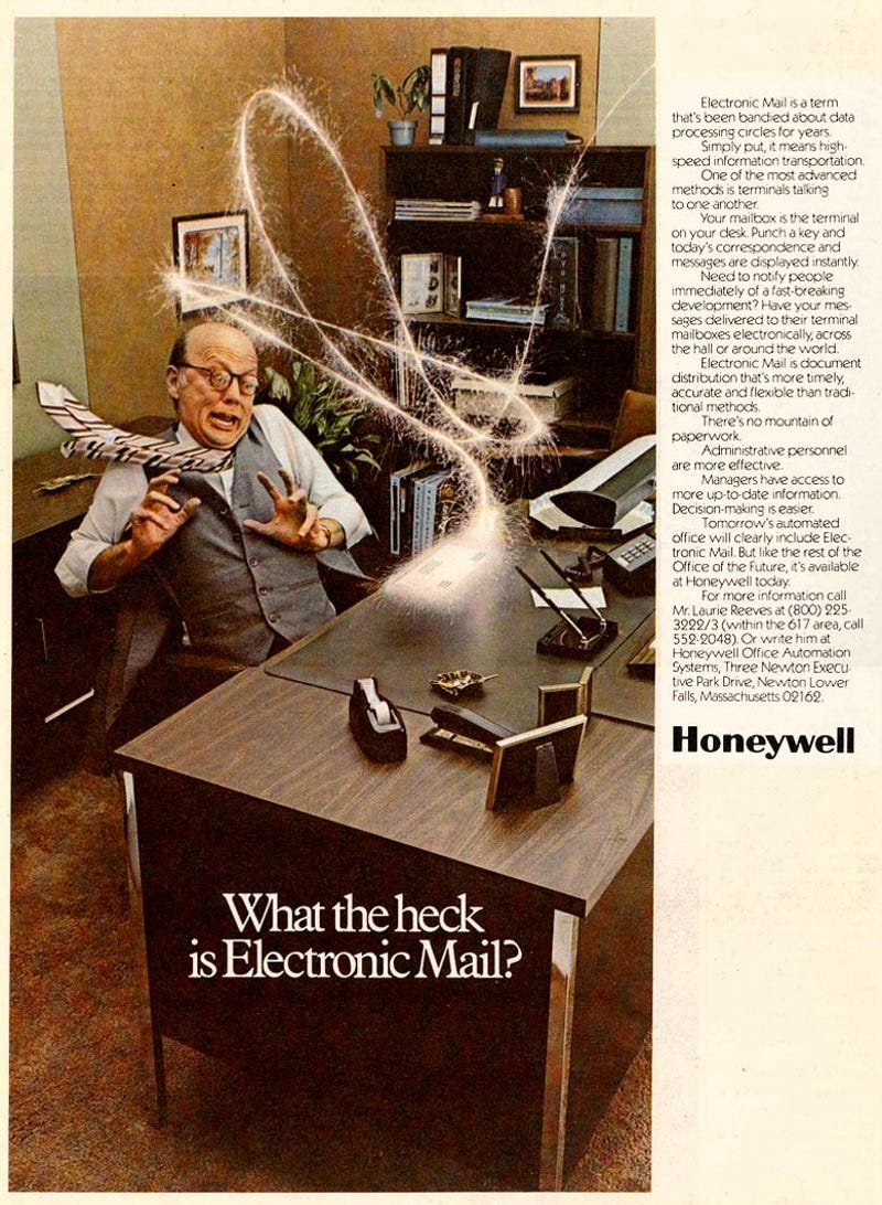
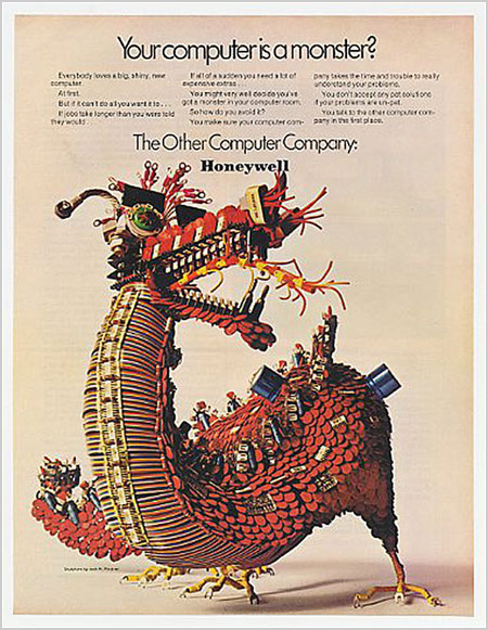
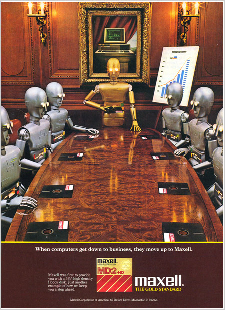
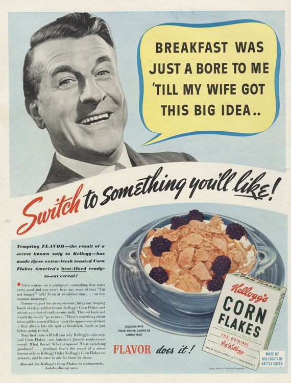
| Arrangement | Climax | Ordered by increasing importance | “Have your messages delivered to their terminal mailboxes electronically, across the hall, or around the world.” |
| Parallelism | Parallelism | Similarity in structure in phrases or clauses | “ Theres no mountain of paperwork. Administrative personal are more effective. Managers have access to more up to date information. Decision making is easier. “ |
| Comparison | Metaphor | An implied comparison | “ Theres no mountain of paperwork.” |
| Exaggeration | Hyperbole | Using exaggerated terms for effect | “ Theres no mountain of paperwork.” |
| Question | Erotema | Asking a rhetorical question | “What the heck is electronic mail?” “Need to notify people immediately of a fast breaking development?” |
| Color | Hue | The identification of the colors | Mustard yellow, Brown, Grey, and Beige for the office. (normal, dull colors) White and yellow for the electricity. |
| Value | The lightness or darkness of a color | Everything besides the electricity bolt is dark. | |
| Perspective | Geometric | An illusion of depth and space | They are obviously trying to make the illusion that this is a real scenario, therefore the scene is geometric rather than flat. |
| Space | Closed | The tops and sides feels closed, trapped. | The picture doesn't show any other space in the room, and makes the image seem busy. |
| Full | The frame is dense with figures. | There is a lot of furniture that fill up the frame. Along with the bolt of electricity. | |
| Focus | Focalizers | Are figures or colors or spaces used to pull the eye across the image? | The lighting bolt not only draws your attention, but plus your eye to the small text. |
| Angle | High Angle | Are we looking down on them? | Yes, almost like we are there at the office, witnessing this ourself. |
| Implied distance | Medium Shots | Waist up? | Yes, you can only see him from the waist up. |
| Figures | Representationality | To what extent does the image show things we can identify? | There are a lot of identifiable things, basically everything that is being shown is the average desk of the working man. They are trying to help other businessmen or women relate. |
| Abstraction | How realistic are the things? | Very realistic | |
| Self- referentiality | Do the brushstrokes or lines call attention to themselves? | The electricity obviously calls attention to itself, and the pattern that its making drawn your eye to the smaller text. | |
| Style | Bold | X | “Honeywell” is in bold. |
| Condensed | X | All of the other texts besides honeywell is somewhat thin. | |
| Family | Serif | X | "What the heck is electronic mail?" |